


This project was to develop a logomark and visual system for my client, Emma Kenny Acupuncture, a local acupuncturist who had recently moved to Edmonton from Vancouver.
I first met with the client to discuss their vision, goals, and desires and for an interesting conversation on the history of Traditional Chinese Medicine. Emma specified and emphasized the language of acupuncture, its storied history, and their place within and sense of belonging to the world of TCM as a white person. She expressed how she wanted to avoid any symbols or elements that seemed 'orientalized' or could in any way be associated with Chinese characters.
She wanted a logomark that felt modern, refined, and elegant while paying homage to acupuncture as a practice and that could potentially be used in the future for any tangible products she may make, such as oils, balms, robes, bags, and accessories. My vision was to create a symbol that encompasses all of these concepts and would feel like it belongs at a Sephora or a high-end spa.


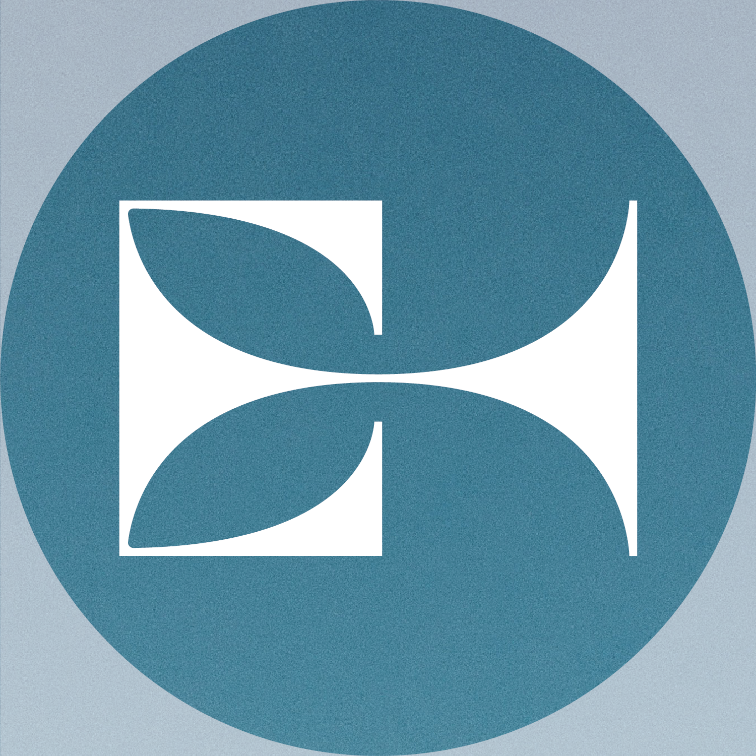
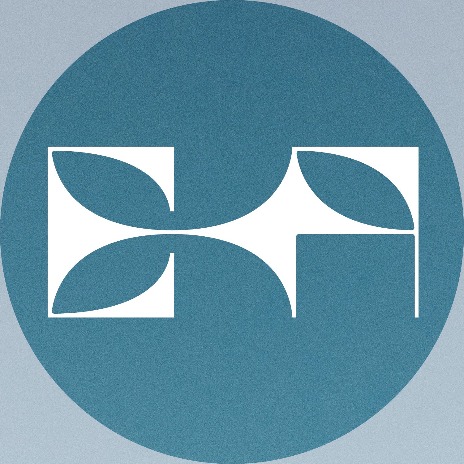
I initially began sketching abstract representations of the different processes she would use as an acupuncturist. I wanted to incorporate her initials - EK - into the logomark in a reflecting relationship. I was really drawn to the square "EKA" figure/ground relationship in the middle, as the reflecting "EK" shape looked both calming and refined and reminded me of a lotus flower.
I began to explore different ways of balancing this EKA relationship, working with different widths, stroke sizes, and shapes to make the "A."

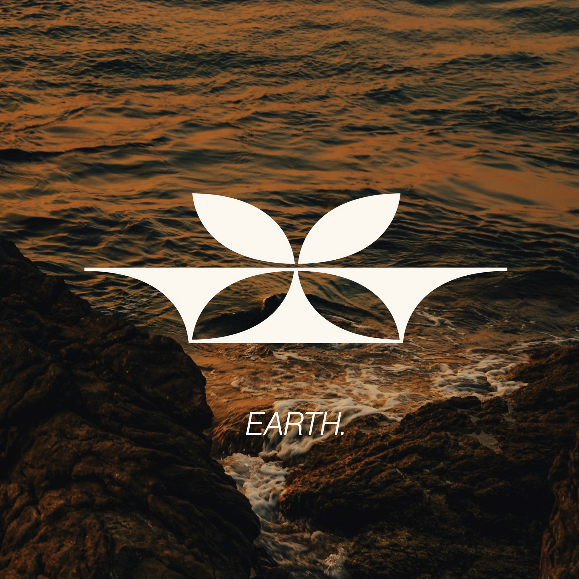
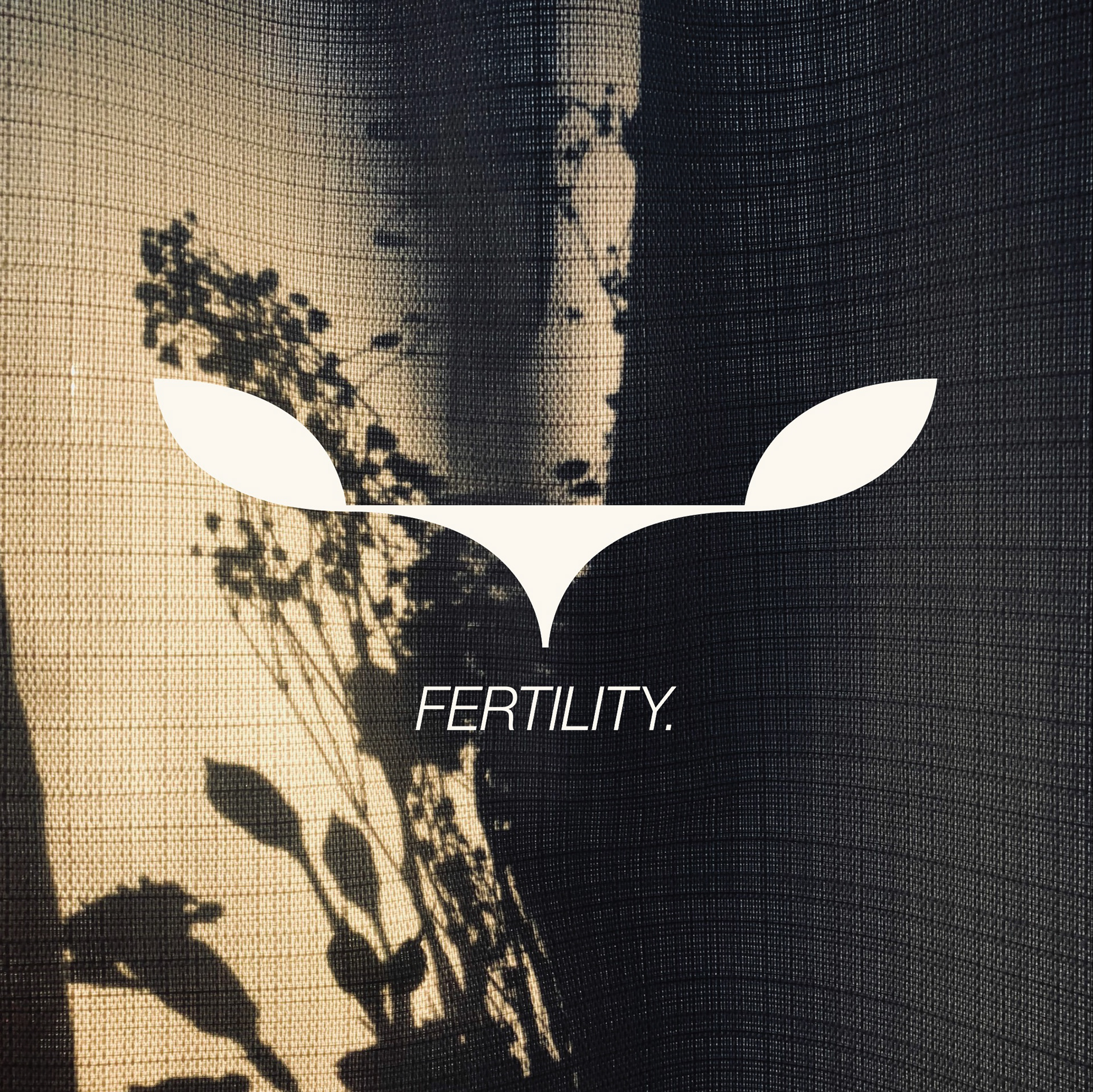
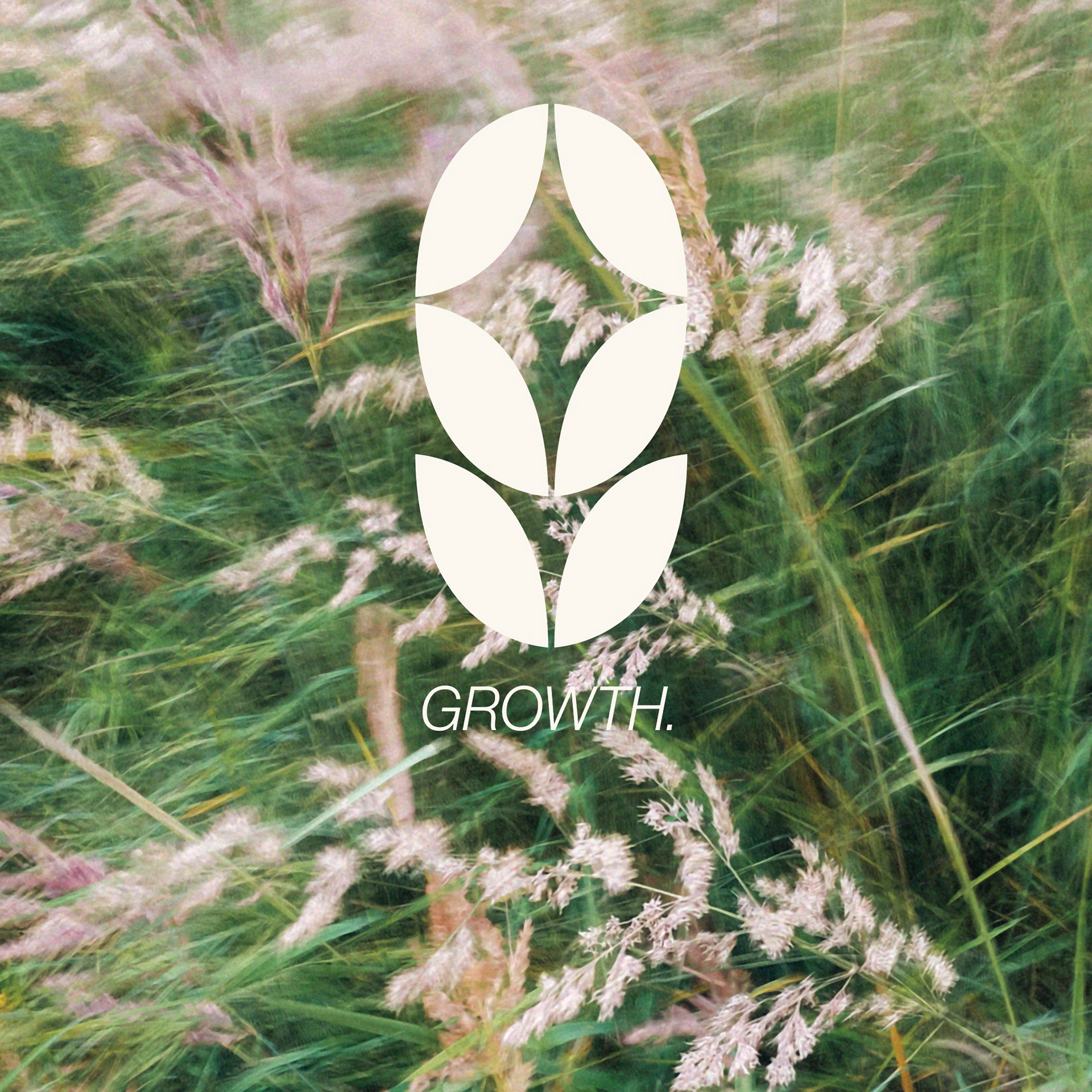
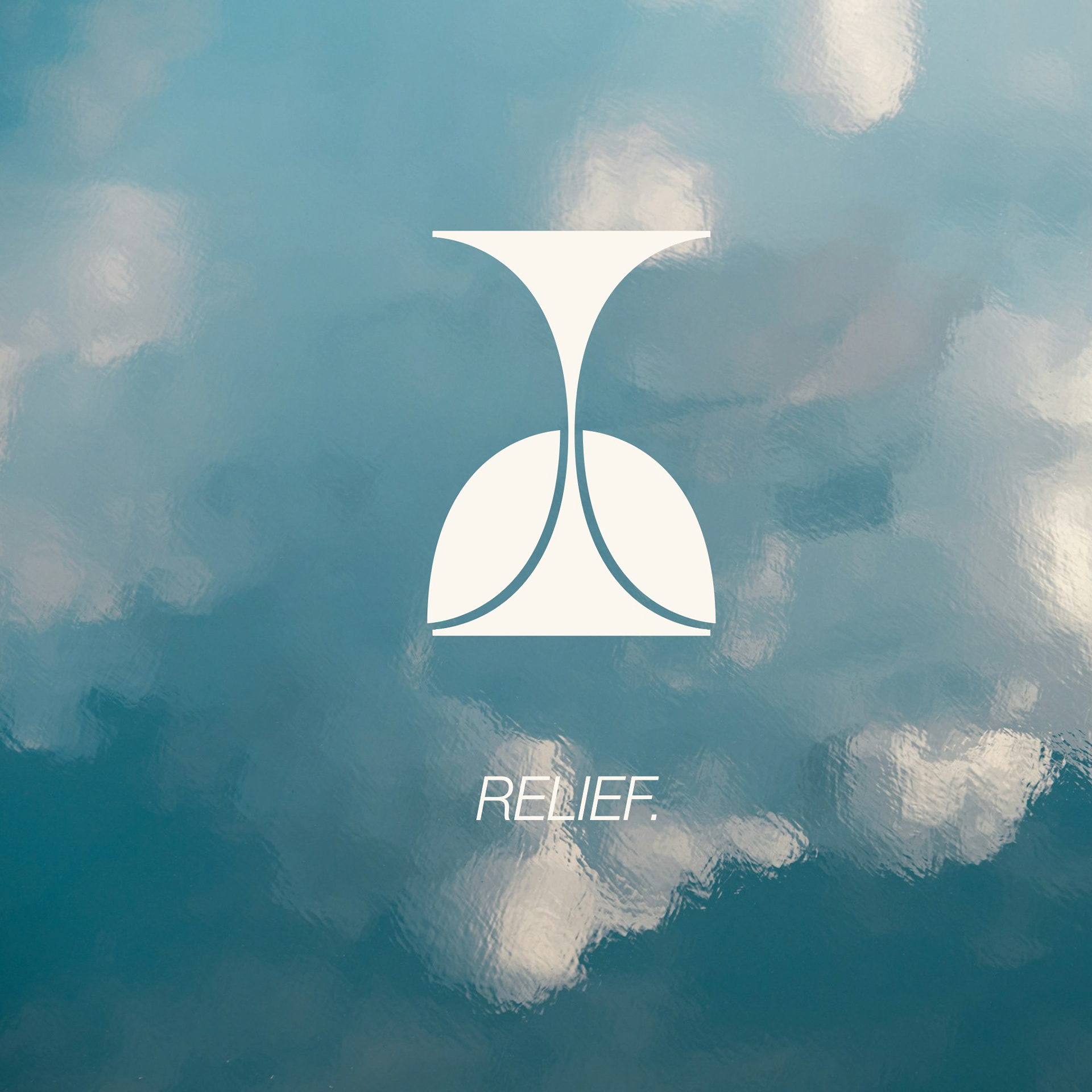
The final logomarks seen below feature thin strokes and guides as coming to direct points of tension but have soft curves to evoke the feeling of relief one feels upon receiving acupuncture treatment, all while showing an abstract positive/negative space rendering of Emma's "EK" initials that can also be seen as the petals of a lotus flower, an important symbol in Chinese Traditional Medicine.
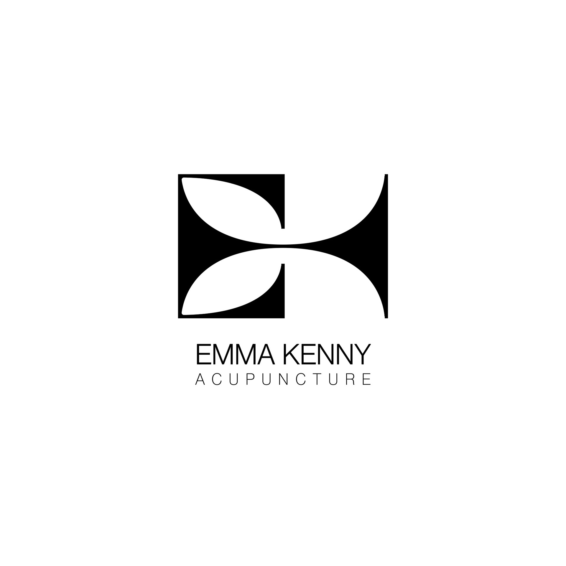
Primary Logomark
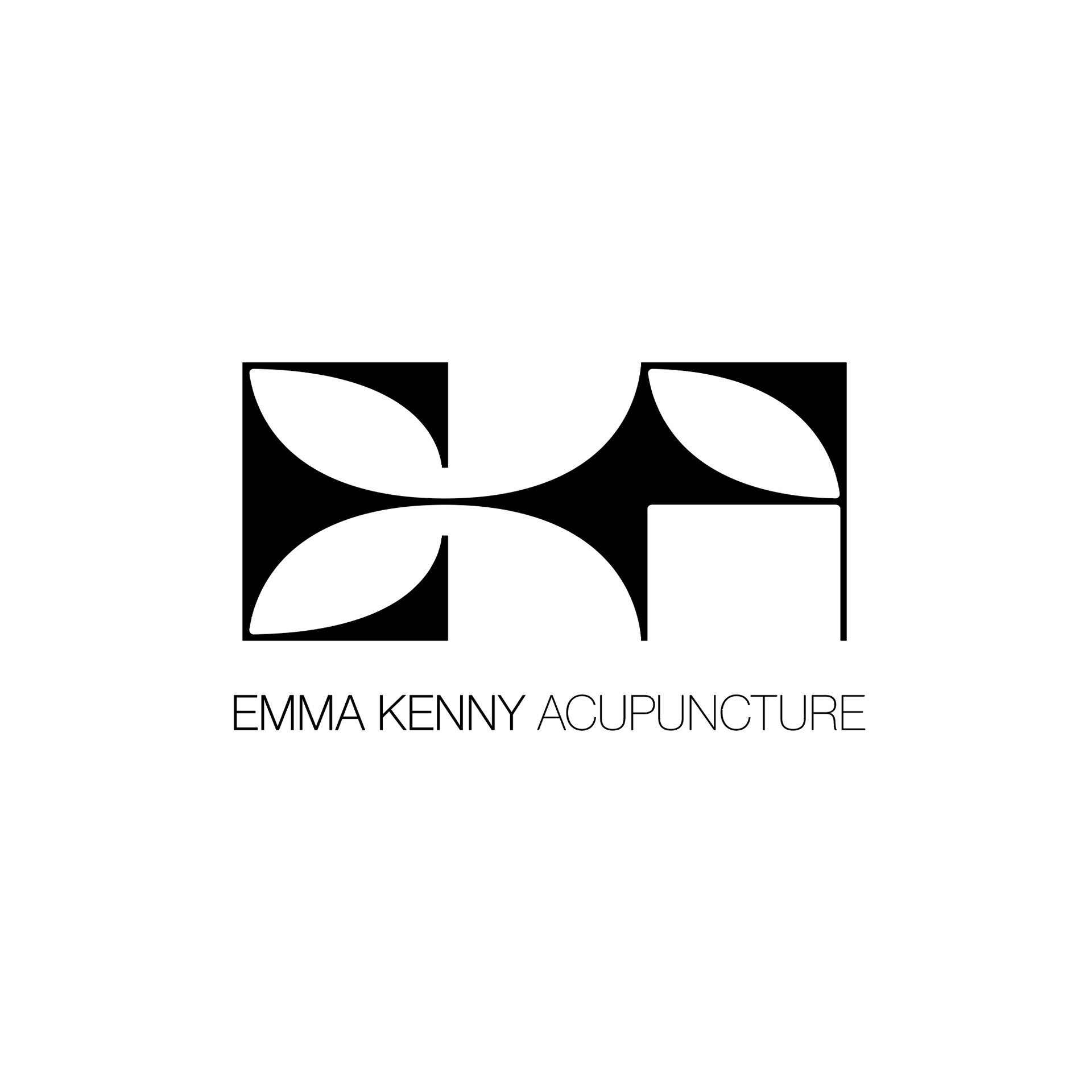
Secondary Logomark
While exploring my sketches, I decided that I wanted to develop not only a logomark for her but a system of different visuals that she could use to showcase the many different processes and services she offers - inspired by the emphasis on the 'language' of acupuncture, I wanted to make her a language of visual communication.
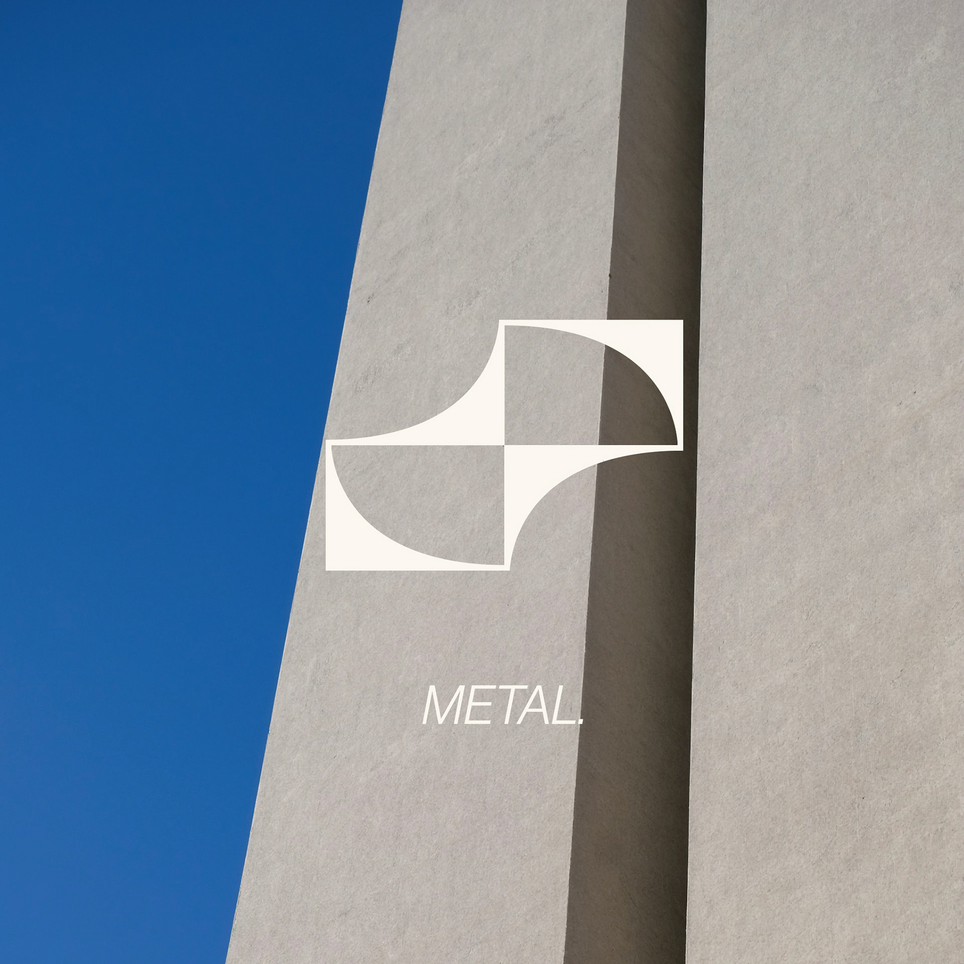
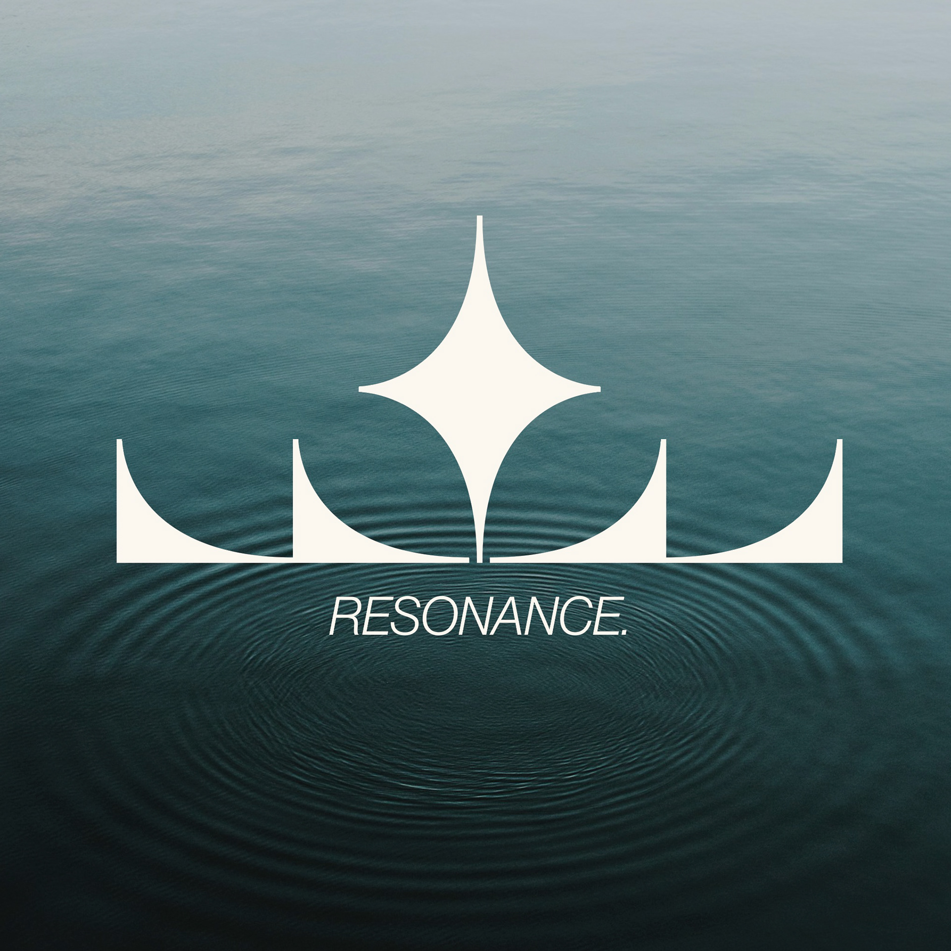
I broke down the Logomark into its base shapes, and experimented with how I could use those shapes to represent the services, inspirations of, and founding principles of Emma Kenny Acupunture.

The symbols and treatments below represent the primary TCM elements, and the services Emma offers.


Different Social Media logomark treatments over the brand's signature colour of blue, which was chosen both for its calming qualities and because it is the same colour as Emma's eyes.